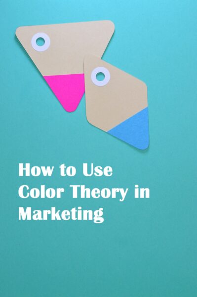
Colors are one of the crucial elements for designing advertisements and other marketing materials. It is a form of nonverbal communication that helps in establishing brand identity, comprehension and improving readership of ads.
Colors and their underlying fabric of historical and sociological implications can evoke specific reactions in emotions and associations. This guides advertisers to target their campaign more precisely. Let us have a quick look at the significance of using different colors in marketing.
Significance of association
This may be divided into two broad sections – natural associations and psychological or cultural associations. Some colors have natural and universal implications. For example, green is the major color of plants and usually associated with nature. Blue is the color of sky and oceans and yellow is the color of sun and happiness. Such associations are somewhat universal and simple and referred to as “natural association of colors”.
Cultural and psychological associations are more delicate. Say for example, in the USA, orange is associated with Halloween because of pumpkin but this association is not relevant in cultures that don’t have this celebration. Similarly, black is the color of death in the West but there are areas where death is represented by white.
The colors
While colors maybe not as clear as words but each has certain significance and appeal. Let us have a brief look at some commonly used colors in advertisements and areas where they appeal.
Blue
This is arguably the most popular color of advertisers ProjectfreeTV. It appears in different hues in oceans, skies, and seas across the globe and has enjoyed a universal appeal. Blue is associated with clear thinking and reflects intellect. Such association makes the color a good choice for anything that involves a high degree of precision like computing products, sophisticated gadgets, and cars, etc. The color is also popular among corporate users and widely used in logos.
Darker shades of blue are associated with masculine products. Lighter shades of blue convey happier, sparkling and used in ads of cleaning products and kinds of toothpaste. Bright blue is also used for the favorite choice to represent vacations. Cloudless blue skies and tranquil oceans evoke a relaxing appeal.
Green
Green is associated with fresh, fertile and natural things. It is a positive color that induces calm and restfulness. Darker greens used in banknotes and bills are associated with finance. This added with growth and fertility makes it a good choice for promoting financial products like insurance plans and saving schemes.
Lime greens having touches of effervescent yellow aptly represents freshness. This is widely used in energy inducing products and fresh juices. Green is also used to market eco-friendly products and services. The color represents “go” in traffic systems around the world. This link with movement has made it a popular choice for anything related to transport. For online advertisements, the trend is using green colors in buttons that you want the user to click.
Red
This is the most powerful and vibrant of all colors. Red suggests strong emotions and excitement. It is easily recognized by eye and good for drawing immediate attention. The color is associated with fire and blood and this association is true for several cultures and regions. Red is also associated with energy, passion, desire, and danger. From a marketing perspective, red is regarded as arousing and sexually appealing to men and women. As such, it is used in products and services related to these emotions. Apart from physical reactions evoked by the color, red is associated with power and force. This association is capitalized by using the color in ads of sports-related products.
Yellow
This color represents fun, energy, and vibrancy. It is closely associated with happiness, warmth and positive energy. Products related to stimulus and vitality like vitamin supplements, energy drinks, and sports equipment can use this color effectively in marketing. Bright yellow is also great for drawing attention. As such, it is widely used as a background for a large amount of text that requires close attention, like display boards depicting instruction, rules, and regulations.
Black
There are several negative aspects associated with black but it is also regarded as color to signify exclusivity, authority, and prestige. In general, black is often used for denoting sophistication and luxury. Black also helps in creating a sense of depth when used in the backdrop of the luxury image. In western culture, black is also used as the color of death. Products and services targeting men can think of using black with touches of red to evoke their attention.
White
White signifies purity, cleanliness and spiritual health in most cultures. It is considered as no color that can be used to represent unadulterated products. White is also used to create a sense of space and depth in advertisements. In contemporary ads white is used with an accent color to highlight and create an emotional resonance. White is also used for luxury and sophisticated items.
Purple
Purple is regal, mysterious and alluring. It is relatively uncommon and highly valued for its scarcity. It has been highly valued by nobles and associated with wealth and prestige. A touch of purple in some common products can create an impression of luxury. A car available for hire can add a touch of purple to show that it is a luxury car. It has been noticed that women find this color extremely erotic and it is far more girly color than the suspected pink. As such, products striving to draw the attention of women may consider using dashes of purple in marketing campaigns.
Brown
So what about the guys! Well in addition to classic black men love brown with dashes of blue. Brown is considered dependable, solid and earthly. It may lack the vibrancy of other colors but it is associated with trustworthiness and reliability. Brown is the color if you are looking to convey these messages in an ad campaign aimed at men.
Closing notes
While using color in marketing it is desirable not to get carried away. Using too many colors may spoil the copy and distract viewers. Using only two colors can save the cost of printing. When there is doubt about using the right color Pubg wallpaper, think of blue. Shades of blue are considered safe (except for food items). Some colors like brown, purple, pink and orange may not print the way you want them.